Details
How a Health and Wellness Brand Explained Product Benefits Without Overwhelming Customers
How a Health and Wellness Brand Explained Product Benefits Without Overwhelming Customers

1. Project Overview
A growing health and wellness brand needed an e-commerce website that could explain its products clearly without overwhelming customers with long descriptions, technical language, or unsupported health claims.
The business offered wellness products across several categories, including natural foods, personal-care items, herbal products, wellness accessories, and everyday lifestyle products.
Customers were interested in the products but often needed help understanding:
- What each product was designed for
- Which ingredients it contained
- How it could fit into a daily routine
- Who the product might be suitable for
- How to use and store it
- What quantity or variation was available
- Whether any precautions applied
- How to place an order
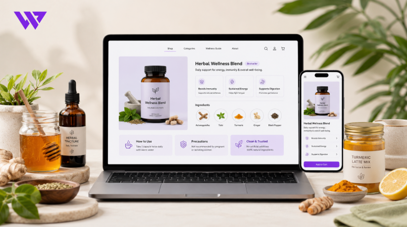
Webnion planned a responsive health and wellness e-commerce experience that organized product information into clear, readable sections.
The goal was to help customers understand products more confidently while keeping the website simple, responsible, and easy to browse on mobile devices.
2. The Business Challenge
Health and wellness products often require more explanation than ordinary retail items.
When information is too limited, customers may not understand the value of the product. When too much information is presented at once, the page can feel complicated and difficult to trust.
The brand faced several common challenges:
- Product descriptions were too long
- Important benefits were hidden inside paragraphs
- Technical ingredient names confused customers
- Different products appeared to make similar claims
- Usage instructions were inconsistent
- Safety and precaution information was difficult to find
- Customers repeatedly asked the same questions
- Mobile product pages felt overcrowded
- Promotional language sometimes competed with factual information
- Customers needed a clearer path from product understanding to ordering
The business needed a content structure that could educate customers without making medical promises or creating unnecessary confusion.
3. Project Objectives
The project was planned around the following objectives:
- Explain product benefits in simple language
- Keep important information easy to scan
- Separate benefits from medical claims
- Present ingredients transparently
- Show usage instructions clearly
- Make precautions easy to find
- Improve mobile product browsing
- Reduce repetitive pre-purchase questions
- Build trust through responsible communication
- Support product variations and bundles
- Simplify the cart and checkout journey
- Create a scalable structure for future wellness products
Every section was designed to improve clarity, confidence, and responsible product presentation.
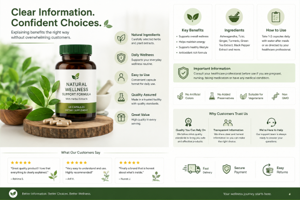
4. Our Strategy
We planned the product experience around the questions customers usually ask:
What is this product?
Why might it be useful?
What does it contain?
How should it be used?
What should I know before ordering?
The intended journey was:
Discover the product → Understand its purpose → Review key benefits → Check ingredients and usage → Read precautions → Review customer feedback → Add to cart
Instead of showing every detail at the top of the page, information was presented in layers.
The most important content appeared first, while detailed information remained available for customers who wanted to explore further.
This created a better experience for both quick shoppers and careful researchers.
5. Benefit-Led Product Summaries
Each product page began with a concise summary focused on its purpose.
The summary could explain:
- What type of product it was
- How it could fit into a daily routine
- Which customer need it was designed around
- What made it different from similar products
For example:
“A convenient herbal drink mix designed for customers who want to include a warm, naturally inspired beverage in their daily wellness routine.”
This type of description communicates the intended use without claiming that the product cures, treats, or prevents a medical condition.
6. Clear Key Benefits
Product benefits were presented as short, readable points instead of long promotional paragraphs.
Depending on verified product information, the page could highlight benefits such as:
- Easy to include in a daily routine
- Convenient serving format
- Made with selected ingredients
- Suitable for home or travel use
- Clear preparation instructions
- Available in multiple sizes
- Simple storage requirements
- Designed for everyday wellness support
The website avoided guarantees about specific health outcomes.
Benefits were based on product characteristics, approved information, and realistic customer use.
7. Separating Benefits from Medical Claims
A wellness website needs responsible language.
The product pages avoided claims such as:
- Cures disease
- Guarantees weight loss
- Permanently removes pain
- Replaces medication
- Prevents serious illness
- Works for everyone
- Produces immediate results
Instead, the content focused on:
- Product purpose
- Ingredients
- Daily use
- General wellness positioning
- Convenience
- Customer experience
- Manufacturer-provided information
Where a product required professional guidance, the website encouraged customers to consult a qualified healthcare professional.
This helped protect customer trust and reduced the risk of misleading communication.
8. Organized Ingredient Information
Ingredients were presented in a structured and understandable way.
The product page could include:
- Key ingredients
- Complete ingredient list
- Ingredient source where verified
- Quantity or concentration where available
- Allergen information
- Added sugar information
- Artificial color or flavor information
- Dietary information where verified
Technical ingredient names could be accompanied by a short explanation of their role in the product.
However, the website avoided making unsupported claims about what an ingredient would do inside the body.
9. Product Information Tabs or Sections
Long product pages were divided into clear sections such as:
- Product Overview
- Key Benefits
- Ingredients
- How to Use
- Who It Is For
- Precautions
- Product Details
- Customer Reviews
- Delivery and Returns
On mobile devices, these sections could appear as accordions.
Customers could open only the information they needed instead of facing one long block of text.
This reduced visual overload and made the page easier to navigate.
10. Simple Usage Instructions
Usage instructions were written as clear steps.
Depending on the product, the page could explain:
- Recommended serving or quantity
- Preparation method
- Time of use
- Frequency
- Required accessories
- Storage after opening
- Cleaning instructions
- Manufacturer guidance
For example:
- Add the recommended quantity to a cup.
- Mix with warm water according to the package instructions.
- Stir well before use.
- Store the remaining product in a cool, dry place.
Instructions were based on verified product information rather than assumptions.
11. Who the Product Is For
The website could explain the intended customer group in a responsible way.
Examples included:
- Adults looking for a convenient wellness product
- Customers interested in natural food products
- People seeking simple daily self-care items
- Buyers looking for a practical wellness gift
- Customers who prefer specific product formats
The page also clarified when the product might not be suitable.
Age, pregnancy, allergies, medication use, and medical conditions were not treated casually.
Where appropriate, customers were advised to seek professional guidance before use.
12. Precautions and Important Information
Safety information needed to remain visible and easy to understand.
The product page could include:
- Allergy warnings
- Age restrictions
- Pregnancy or breastfeeding guidance
- Medication-related precautions
- Storage instructions
- Recommended serving limits
- Keep-out-of-reach-of-children guidance
- Product-label instructions
- When professional advice may be needed
Important warnings were not hidden inside the footer or a long paragraph.
They were presented close to the product details and purchasing area.
13. Product Variations
Wellness products may be available in different:
- Sizes
- Quantities
- Flavors
- Formats
- Pack combinations
- Gift packages
- Subscription or repeat-order options
Each variation could maintain separate:
- Price
- Stock
- SKU
- Product image
- Quantity
- Availability
Customers were required to select the correct option before adding the product to the cart.
This reduced incomplete orders and made pricing more transparent.
14. Visual Product Presentation
Customers needed to see what they would receive.
The product image gallery could include:
- Front packaging
- Back label
- Ingredient panel
- Product contents
- Serving-size reference
- Product texture
- Preparation example
- Size comparison
- Lifestyle use
- Packaging and delivery presentation
Label images were especially useful because customers could review verified information directly from the product packaging.
Consistent photography also strengthened the professional appearance of the brand.
15. Icons for Faster Understanding
Simple icons were used to help customers scan product information.
Icons could represent:
- Product format
- Serving quantity
- Storage
- Preparation time
- Package size
- Delivery
- Verified product attributes
- Suitable use
Icons supported the written content but did not replace important explanations.
The website avoided using badges that could create unsupported health or certification claims.
16. Product Comparison
Customers may compare several wellness products before deciding.
A comparison experience could include:
- Product type
- Main ingredients
- Product format
- Pack size
- Usage method
- Price
- Recommended use
- Stock availability
- Customer rating
This helped customers understand the differences without opening several pages repeatedly.
The comparison focused on factual product information rather than claiming that one item would produce a guaranteed health result.
17. Product Categories
The store could organize products into clear categories such as:
- Natural food products
- Herbal products
- Personal care
- Everyday wellness
- Healthy snacks
- Honey and natural sweeteners
- Wellness accessories
- Gift collections
- New arrivals
- Best sellers
Products could also be organized by customer need, provided the category language remained responsible.
Examples included:
- Daily routine
- Relaxation and self-care
- Active lifestyle
- Travel-friendly wellness
- Gift ideas
This made product discovery easier without using disease-based claims.
18. Guided Product Discovery
Some customers were unsure which product to choose.
A simple product finder could ask:
- What type of product are you looking for?
- Which format do you prefer?
- What is your budget?
- Do you have any ingredient preferences?
- Are you buying for yourself or as a gift?
- Which pack size do you prefer?
The results could recommend relevant categories or products.
The product finder was not presented as a medical diagnosis tool.
It supported product discovery while encouraging customers to seek professional guidance for health-related decisions.
19. Frequently Asked Product Questions
Each product page could answer common questions such as:
- What is included in the package?
- How should the product be used?
- How should it be stored?
- Which sizes are available?
- Does it contain a specific ingredient?
- Is it suitable for a particular age group?
- How long will one package last?
- Can it be used with other products?
- What should I do if I have an allergy or medical condition?
Frequently asked questions reduced repetitive inquiries while keeping important information accessible.
20. Customer Reviews and Responsible Social Proof
Customer reviews helped potential buyers understand practical experiences.
Reviews could discuss:
- Packaging
- Taste or fragrance
- Ease of use
- Product quality
- Delivery condition
- Customer service
- Repeat purchasing
- Overall satisfaction
The website avoided presenting individual customer experiences as guaranteed results.
Reviews that made extreme medical claims could require moderation or clarification.
This helped preserve the usefulness of customer proof without creating misleading expectations.
21. Expert or Educational Content
The brand could publish educational articles related to general wellness and product use.
Examples included:
- How to read a product label
- How to store natural food products
- How to build a simple self-care routine
- Questions to ask before choosing a wellness product
- Understanding product sizes and serving information
- How to compare wellness products responsibly
Educational content supported SEO and customer trust.
Health-related articles needed careful sourcing and should not replace advice from qualified professionals.
22. Mobile-Friendly Product Pages
Many customers arrived through Facebook, Instagram, Google search, Messenger, and mobile advertising.
The mobile experience allowed customers to:
- View product images
- Read the summary
- Review benefits
- Open ingredient details
- Check usage instructions
- Read precautions
- Select a variation
- Review customer feedback
- Add the product to the cart
- Contact the business
Content sections remained compact and readable on smaller screens.
Important warnings and purchasing actions stayed easy to access.
23. Mobile Page Performance
Wellness product pages often include several images, explanations, and reviews.
The website was planned with attention to:
- Optimized WebP images
- Responsive image sizes
- Lazy loading
- Reduced unnecessary scripts
- Efficient fonts
- Clean front-end code
- Lightweight accordion sections
- Appropriate caching
Faster loading helped customers reach important product information without unnecessary waiting.
This was especially important for mobile visitors using slower connections.
24. Search and Filters
Customers could narrow products using filters such as:
- Category
- Product format
- Ingredient preference
- Brand
- Pack size
- Price range
- Availability
- New arrivals
- Best sellers
- Customer rating
The filters avoided disease-related targeting or unsupported health promises.
The goal was to help customers find relevant product types more quickly.
25. Wellness Bundles
The brand could create product bundles based on practical use.
Examples included:
- Daily wellness collection
- Natural food bundle
- Self-care gift set
- Travel-friendly wellness pack
- Honey and beverage set
- Personal-care bundle
Each bundle could explain:
- Products included
- Quantities
- Intended use
- Individual value
- Bundle price
- Total savings
- Storage information
- Stock availability
Bundle descriptions remained realistic and avoided promising combined medical outcomes.
26. Repeat-Purchase Support
Some wellness products are purchased regularly.
The website could support:
- Wishlist
- Saved products
- Previous orders
- Quick reorder
- Restock reminders
- Repeat-purchase options
Customers remained in control of future purchases.
Reminder language avoided pressure and did not encourage inappropriate overuse.
27. Transparent Pricing
The product page could clearly show:
- Current price
- Previous price
- Discount percentage
- Pack quantity
- Price per unit where useful
- Bundle savings
- Delivery charge
- Final payable amount
Transparent pricing helped customers compare different pack sizes.
It also reduced confusion during checkout.
28. Mobile Cart and Checkout
The cart clearly displayed:
- Product image
- Product name
- Selected variation
- Pack size
- Quantity
- Unit price
- Discount
- Subtotal
The checkout could collect:
- Customer name
- Phone number
- Delivery address
- Shipping area
- Order notes
- Payment method
The final summary showed products, delivery charge, discounts, and the total amount.
The checkout process remained simple and mobile-friendly.
29. Trust-Building Information
A health and wellness brand needs strong transparency.
The website could include:
- Business identity
- Contact information
- Product-label images
- Manufacturer or supplier information
- Ingredient details
- Customer reviews
- Delivery policy
- Return and exchange conditions
- Secure checkout indicators
- Customer-support options
Certificates, approvals, or quality claims were displayed only when the business could provide valid supporting documentation.
Trust was built through evidence and clarity rather than exaggerated marketing.
30. Search Engine Optimization Structure
The website supported SEO through clear product, category, and educational pages.
Potential search-focused content could include:
- Natural wellness products online
- Herbal product store
- Everyday wellness products
- Natural food products
- Wellness gift sets
- Product ingredient guides
- How to use a specific product type
- How to compare wellness products
Each page could include:
- Helpful introduction
- Product information
- Responsible benefit explanations
- Frequently asked questions
- Internal links
- Descriptive page title
- Meta description
- Image alt text
The content was written for customers first and avoided unnatural keyword repetition.
31. Internal Linking
Internal links connected related products and educational content.
For example:
- A honey product could link to natural food collections
- A wellness bundle could link to its individual products
- A product page could link to usage guidance
- An ingredient guide could link to relevant products
- A personal-care product could link to storage and care instructions
This helped customers continue learning without returning to the main navigation.
It also created a stronger website structure for search engines.
32. Analytics and Customer Behavior
The website could track actions such as:
- Category visits
- Product views
- Ingredient-section interactions
- FAQ openings
- Product comparisons
- Add-to-cart actions
- Checkout starts
- Contact-button clicks
- Completed orders
This data helped the business understand which information customers found most useful.
No unverified sales, health outcomes, or conversion percentages were claimed.
33. Design Approach
The visual direction focused on clarity, calmness, trust, and responsible product communication.
The design system included:
- Clean light backgrounds
- Natural brand accents
- Readable typography
- Clear product imagery
- Simple benefit cards
- Organized ingredient sections
- Mobile-friendly accordions
- Visible precautions
- Consistent product cards
- Focused purchase buttons
The design avoided overcrowded layouts and excessive health-related badges.
Products and verified information remained the main focus.
34. Key Features Delivered
The health and wellness e-commerce solution included:
- Responsive e-commerce website design
- Clear product summaries
- Benefit-led content sections
- Responsible claim management
- Organized ingredient information
- Usage instructions
- Precautions and warnings
- Product variations
- High-quality image galleries
- Product comparison
- Guided product discovery
- Frequently asked questions
- Customer review moderation
- Educational content structure
- Mobile-friendly product pages
- Product search and filters
- Wellness bundles
- Repeat-purchase support
- Transparent pricing
- Mobile cart and checkout
- Trust and documentation sections
- SEO-friendly category pages
- Internal linking
- Customer-behavior tracking
- Scalable product management
Each feature was selected to improve understanding, trust, usability, and responsible online selling.
35. The Outcome
The completed solution created a clearer product-discovery experience for the health and wellness brand.
Customers could understand a product’s purpose, key benefits, ingredients, usage instructions, and precautions without reading one overwhelming block of content.
The business gained a consistent structure for presenting existing and future products.
No unverified health, sales, traffic, or conversion results are being claimed. However, the website directly addressed common communication problems that can reduce customer confidence in health and wellness e-commerce.
36. Business Value Created
The website helps the health and wellness brand:
- Explain products more clearly
- Reduce customer confusion
- Present benefits responsibly
- Avoid overwhelming product pages
- Make ingredients easier to understand
- Highlight important precautions
- Reduce repetitive questions
- Improve mobile browsing
- Build trust through transparency
- Promote bundles clearly
- Support repeat purchases
- Strengthen educational SEO content
- Maintain consistent product communication
- Add future products more easily
The project demonstrates that better product communication is not about saying more.
It is about presenting the right information in the right order.
37. Why This Project Matters
Customers want useful information before purchasing wellness products, but too much technical content can create uncertainty.
Overly promotional language can also damage trust when it makes promises that the product cannot responsibly support.
A well-structured health and wellness website connects:
- Product purpose
- Clear benefits
- Ingredients
- Usage
- Precautions
- Customer proof
- Transparent purchasing actions
This helps customers make more informed decisions without being pressured or misled.
The website becomes an educational sales platform rather than a collection of exaggerated product claims.
38. Frequently Asked Questions
How can a wellness website explain benefits without making medical claims?
It can focus on product purpose, ingredients, format, convenience, intended use, and verified manufacturer information without promising treatment or guaranteed health outcomes.
Can ingredients be shown clearly?
Yes. Product pages can include key ingredients, complete ingredient lists, allergen information, and label images.
Can usage instructions be added?
Yes. Verified preparation, quantity, storage, and usage instructions can be presented in simple steps.
Should precautions be visible on the product page?
Yes. Allergy warnings, age restrictions, medication considerations, and other important guidance should be easy to find.
Can customer reviews be published?
Yes. Reviews can be displayed, but extreme medical claims or misleading promises should be moderated.
Can different product sizes have separate prices and stock?
Yes. Every size, flavor, format, or pack option can maintain its own price, stock, SKU, and image.
Is the website suitable for mobile shoppers?
Yes. Benefits, ingredients, warnings, reviews, cart, and checkout can be optimized for smartphones.
Can the website publish wellness articles for SEO?
Yes. Educational articles can support SEO when they are useful, responsibly written, and based on reliable information.
Does the website replace professional medical advice?
No. The website presents product and general educational information. Customers should seek qualified professional advice for medical questions or conditions.
39. Need an E-commerce Website for Your Health and Wellness Brand?
A wellness website should help customers understand products clearly without overwhelming them or making unrealistic promises.
Webnion designs and develops responsive e-commerce websites for:
- Health and wellness brands
- Natural food businesses
- Personal-care brands
- Herbal product stores
- Wellness retailers
- Lifestyle product businesses
- Organic product brands
- Growing online stores
We create product experiences that combine clear benefits, transparent ingredients, responsible communication, mobile usability, and simple purchasing actions.
Build a wellness e-commerce website that helps customers understand your products and trust the way your brand communicates.